We wrote the book on SEO.

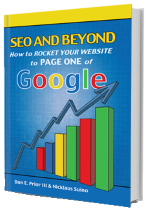
SEO and Beyond is a no-nonsense guide to successfully promoting your website on the internet. It will change the way you think about digital marketing. Packed with sensible advice - everything from choosing the best domain name to how to employ social media - this book reveals the core strategies of two experts in the field who have helped countless small businesses thrive online. You'll find out how SEO really works!

Buy the Book on Amazon.com
SEO And Beyond: How to Rocket your Website to Page One of Google

Focus on These 6 Elements to Improve The Look & Feel of Your Website!

Does your website capture your visitor’s attention?

Are you getting the awareness, leads and sales you want?

Are you lacking good daily website traffic?

Your business may deliver great products or services, but it may be difficult to get the word out. These days, the ultimate place to share your message is online, but it’s more work and requires more specialized knowledge than ever before.

Can your customers easily find what they’re looking for in a timely manner before they click away? Do you have special offers? Can your customers easily find your contact information? According to HubSpot, “55% of visitors spend fewer than 15 seconds on your website.” 15 seconds can go by in a FLASH, so make them count! Customers are likely to click away faster now more than ever as smart phones have taken over the universe!    

We want things to load fast, be available at a moment’s notice, cost a reasonable amount of money and be able to ship in a timely manner. If your website loads slow or if something isn’t clear and to the point, your customers are more likely to take their business elsewhere. Don’t let this happen to you!

According to Lisa Noble, owner of the website design company Vivid Visual Solutions, recommends you take a deep look into each of the following when focusing on creating the look and feel of your website:

1.    Purpose

The first thing the designer determines is why the website or graphic element is being created. What is the main intention for the user’s experience while on the website?

2.    Audience

Who is the ideal user we want to reach?  What is their motivation for coming to the website? Once the designer has answers to the questions below, a design can be created that speaks to a specific audience about their needs or wants.

  • Is the ideal customer male for female?
  • What city or country do they live in?
  • What websites do they like?
  • What magazines do they read?
  • Where are the users hanging out?
  • Where are they shopping?
  • How do they want to feel when they come to website? (happy?, moved? etc.)
  • What is the message that we want to convey?
  • What problem do they have that this website can solve?

3.    Keep the layout simple!

The simplest way to start a layout is to sketch out an idea before you open any tool such as Photoshop or Canva. Set pencil to paper or create a wireframe in software such as Omnigraffle or Balsalmiq. A blueprint is where you work out all the details about functionality or layout before you start the project in Photoshop or other design software. With a blueprint for a house you would determine where the windows and doors will go and work from it. A wireframe is the same thing for a website. Determine where each piece of content will go on each website page before beginning your website design.

  • Use a grid of 960 to layout the elements and help with size requirements, spacing, and creating a responsive layout that will work on mobile devices.
  • Each element on the page should have a reason for being there and should guide the user to do the function of the website.  If you want the user to submit a form, all roads should lead back to the contact form.

4.    Choose a color theme

How do we want the user to feel when they come to website? The designer should ask this question while researching the target audience. Color is the first place we use this information. Color can help convey a mood or a feeling. The designer needs to be mindful of culture differences as well, when creating international websites because colors that mean one thing in the United States can mean something totally different in another country.  See the examples of moods of color below:

  • If the mood should be trustworthy, the user should get a sense that the company has strength. The designer might use a darker shade of blue.  Blue can also be used to convey the mood such as spiritual or symbolize peace.
  • The color red for some can mean passion or love. But it can also mean stop or danger for others.  Use the color red wisely.
  • If the mood should be happy, orange may be used because the color is associated with joy and sunshine. Orange will also convey a sense of energy, enthusiasm, stimulation and encouragement.
  • Complimentary color Pallet of 3 to 5 colors is created to be used throughout the website for text, buttons, icons, links, and forms to keep the look and feel uniform and non-cluttered.
    •  Call-to-actions, which are the instructions placed on the page to tell the user what to do next, should be put on the page using a contrasting color or a color that stands out against the background that it is on. The contrasting color can be on the text itself or it can be on a button with the call-to-action text on it. A great tool to determine complimentary and contrasting colors is https://color.adobe.com/create/color-wheel/

5.    Choose imagery that reflects the user or has context for the text on the page.

  • “A picture is worth a thousand words” This holds true when building a website.  Images create context for the text on the page or mirrors the user and the need they have. The right image will draw attention.  The wrong image will distract.  It is a balance that a designer has to find when selecting an image.  
  • Imagery can be graphical representations of the words such as an offer, photography, icon or shapes representing something such as data.
  •  Imagery should add value.  Images can also help to direct traffic so to speak.  The eyes of a person can focus on a call to action and in turn direct the users eye to that call to action.  Imagery on the page doesn’t have to just be a picture of someone or something, it can also be iconic such as a data icon or an email icon. These symbols depict what the person is going to find in the paragraph or if they submit a contact form.

6.    Choose typography that compliments the mood of the website.

  • If the site should feel modern use modern fonts; if the site should be masculine use a thick masculine font, if the site should be feminine use loopy fonts.  There are a lot of great fonts that can be used and now that Google fonts are available we are not just limited to Arial and Times New Roman.  Designers can be very creative with web fonts.
  • Designers use complimentary font families for harmony in any type of design. The color of the type throughout the website has to be enough and color contrasted on any background color so it is easily read.
  • Type should have a hierarchy using size, bold, italic and other styles, white space around it and color to move the user’s eye down the page.
  • Type can be placed on the page as a graphical image or as html code.
  • Groupings of text elements are easier on the eye than one huge block of text. No one is going to read a huge block of text because it creates instant information overload which will make the user leave the page. The following types of textual elements could be grouped into two paragraphs, four paragraphs, bullet points etc to help with the design or layout, but more importantly for easy readability.
    • Headline
    • Subhead
    • Subhead 2
    • Paragraph text
    • link text
    • bullet points

Not Many People Know What It Takes To Succeed

If you follow the above instructions on look and feel then you’ll have your customer’s hooked when they get to your site. However, you may ask yourself, “How do I get customers to come to my site to begin with? It’s not showing up on Google. What do I do?”

If you want to learn more, read “How to Get the Perfect Website for Your Business.” This article takes you step by step in how to create the perfect website design for your Ann Arbor, Michigan business including what it will take for you to succeed.

You can even sign up for our Black Belt SEO Tips & News! We report on the latest in SEO news and research findings.

Customer’s Who’ve Succeeded: Hear Their Stories!

“The results have been nothing short of phenomenal! Our first job came directly from the web site and resulted in enough profit to cover the cost of the web site for years.”

Andy Bobo, Owner of CMR Mechanical

“The results have been excellent (not good, but excellent)! The owner, Nick, is willing to meet you face-to-face, listen to your concerns, and meet your needs. Our company, Mussio Painting, has skyrocketed to the top of Google and this result has created enough business that I had to turn down five to six calls a day this past season.”

Steve Mussio, Owner of Mussio Painting

“SEO Ann Arbor has helped with our online presence. Almost all of our leads come from online searches.”

Diana Theiss, Owner of Little Angels Preschool & Daycare

Website Design Ann Arbor, Michigan: How Do You Get Started?

Call us at 877-815-6974 to arrange a time to visit or get your questions answered. If you’re more comfortable with email, you can reach us at info@seoannarbor.com (or just contact us here). We can help walk you through the entire website design process, help you identify your goals, and help you develop the look and feel of your website. When done properly, this stuff can take your marketing to a whole new level!


SEO Ann Arbor Blog Entries

Focus on These 6 Elements to Improve The Look & Feel of Your Website!

Does your website capture your visitor’s attention?

Are you getting the awareness, leads and sales you want?

Are you lacking good daily website traffic?

Your business may deliver great products or services, but it may be difficult to get the word out. These days, the ultimate place to share your message is online, but it’s more work and requires more specialized knowledge than ever before.

Can your customers easily find what they’re looking for in a timely manner before they click away? Do you have special offers? Can your customers easily find your contact information? According to HubSpot, “55% of visitors spend fewer than 15 seconds on your website.” 15 seconds can go by in a FLASH, so make them count! Customers are likely to click away faster now more than ever as smart phones have taken over the universe!    

We want things to load fast, be available at a moment’s notice, cost a reasonable amount of money and be able to ship in a timely manner. If your website loads slow or if something isn’t clear and to the point, your customers are more likely to take their business elsewhere. Don’t let this happen to you!

According to Lisa Noble, owner of the website design company Vivid Visual Solutions, recommends you take a deep look into each of the following when focusing on creating the look and feel of your website:

1.    Purpose

The first thing the designer determines is why the website or graphic element is being created. What is the main intention for the user’s experience while on the website?

2.    Audience

Who is the ideal user we want to reach?  What is their motivation for coming to the website? Once the designer has answers to the questions below, a design can be created that speaks to a specific audience about their needs or wants.

  • Is the ideal customer male for female?
  • What city or country do they live in?
  • What websites do they like?
  • What magazines do they read?
  • Where are the users hanging out?
  • Where are they shopping?
  • How do they want to feel when they come to website? (happy?, moved? etc.)
  • What is the message that we want to convey?
  • What problem do they have that this website can solve?

3.    Keep the layout simple!

The simplest way to start a layout is to sketch out an idea before you open any tool such as Photoshop or Canva. Set pencil to paper or create a wireframe in software such as Omnigraffle or Balsalmiq. A blueprint is where you work out all the details about functionality or layout before you start the project in Photoshop or other design software. With a blueprint for a house you would determine where the windows and doors will go and work from it. A wireframe is the same thing for a website. Determine where each piece of content will go on each website page before beginning your website design.

  • Use a grid of 960 to layout the elements and help with size requirements, spacing, and creating a responsive layout that will work on mobile devices.
  • Each element on the page should have a reason for being there and should guide the user to do the function of the website.  If you want the user to submit a form, all roads should lead back to the contact form.

4.    Choose a color theme

How do we want the user to feel when they come to website? The designer should ask this question while researching the target audience. Color is the first place we use this information. Color can help convey a mood or a feeling. The designer needs to be mindful of culture differences as well, when creating international websites because colors that mean one thing in the United States can mean something totally different in another country.  See the examples of moods of color below:

  • If the mood should be trustworthy, the user should get a sense that the company has strength. The designer might use a darker shade of blue.  Blue can also be used to convey the mood such as spiritual or symbolize peace.
  • The color red for some can mean passion or love. But it can also mean stop or danger for others.  Use the color red wisely.
  • If the mood should be happy, orange may be used because the color is associated with joy and sunshine. Orange will also convey a sense of energy, enthusiasm, stimulation and encouragement.
  • Complimentary color Pallet of 3 to 5 colors is created to be used throughout the website for text, buttons, icons, links, and forms to keep the look and feel uniform and non-cluttered.
    •  Call-to-actions, which are the instructions placed on the page to tell the user what to do next, should be put on the page using a contrasting color or a color that stands out against the background that it is on. The contrasting color can be on the text itself or it can be on a button with the call-to-action text on it. A great tool to determine complimentary and contrasting colors is https://color.adobe.com/create/color-wheel/

5.    Choose imagery that reflects the user or has context for the text on the page.

  • “A picture is worth a thousand words” This holds true when building a website.  Images create context for the text on the page or mirrors the user and the need they have. The right image will draw attention.  The wrong image will distract.  It is a balance that a designer has to find when selecting an image.  
  • Imagery can be graphical representations of the words such as an offer, photography, icon or shapes representing something such as data.
  •  Imagery should add value.  Images can also help to direct traffic so to speak.  The eyes of a person can focus on a call to action and in turn direct the users eye to that call to action.  Imagery on the page doesn’t have to just be a picture of someone or something, it can also be iconic such as a data icon or an email icon. These symbols depict what the person is going to find in the paragraph or if they submit a contact form.

6.    Choose typography that compliments the mood of the website.

  • If the site should feel modern use modern fonts; if the site should be masculine use a thick masculine font, if the site should be feminine use loopy fonts.  There are a lot of great fonts that can be used and now that Google fonts are available we are not just limited to Arial and Times New Roman.  Designers can be very creative with web fonts.
  • Designers use complimentary font families for harmony in any type of design. The color of the type throughout the website has to be enough and color contrasted on any background color so it is easily read.
  • Type should have a hierarchy using size, bold, italic and other styles, white space around it and color to move the user’s eye down the page.
  • Type can be placed on the page as a graphical image or as html code.
  • Groupings of text elements are easier on the eye than one huge block of text. No one is going to read a huge block of text because it creates instant information overload which will make the user leave the page. The following types of textual elements could be grouped into two paragraphs, four paragraphs, bullet points etc to help with the design or layout, but more importantly for easy readability.
    • Headline
    • Subhead
    • Subhead 2
    • Paragraph text
    • link text
    • bullet points

Not Many People Know What It Takes To Succeed

If you follow the above instructions on look and feel then you’ll have your customer’s hooked when they get to your site. However, you may ask yourself, “How do I get customers to come to my site to begin with? It’s not showing up on Google. What do I do?”

If you want to learn more, read “How to Get the Perfect Website for Your Business.” This article takes you step by step in how to create the perfect website design for your Ann Arbor, Michigan business including what it will take for you to succeed.

You can even sign up for our Black Belt SEO Tips & News! We report on the latest in SEO news and research findings.

Customer’s Who’ve Succeeded: Hear Their Stories!

“The results have been nothing short of phenomenal! Our first job came directly from the web site and resulted in enough profit to cover the cost of the web site for years.”

Andy Bobo, Owner of CMR Mechanical

“The results have been excellent (not good, but excellent)! The owner, Nick, is willing to meet you face-to-face, listen to your concerns, and meet your needs. Our company, Mussio Painting, has skyrocketed to the top of Google and this result has created enough business that I had to turn down five to six calls a day this past season.”

Steve Mussio, Owner of Mussio Painting

“SEO Ann Arbor has helped with our online presence. Almost all of our leads come from online searches.”

Diana Theiss, Owner of Little Angels Preschool & Daycare

Website Design Ann Arbor, Michigan: How Do You Get Started?

Call us at 877-815-6974 to arrange a time to visit or get your questions answered. If you’re more comfortable with email, you can reach us at info@seoannarbor.com (or just contact us here). We can help walk you through the entire website design process, help you identify your goals, and help you develop the look and feel of your website. When done properly, this stuff can take your marketing to a whole new level!


SEO Ann Arbor is Rebranding to Michigan SEO Group!

We're in the process of rebranding to Michigan SEO Group as a result of our growth and expanding market.
Click the logo to learn more!

If you're interested in SEO, give us a call.

Have a conversation, and we'll give you a free copy of our book. No obligation or hard sell.

Call 877-815-6974 or email us for your free consultation!

Want to learn more about marketing your business?

You'll receive our free guide, '7 Essential SEO Tips You Can Use RIGHT NOW!'

Get your guide to using Adwords, advice on how to handle negative reviews, and some tips.

You can unsubscribe at any time!

HAPPY CLIENTS

SEO Ann Arbor has assisted our Global Sales Team by increasing our number of customer inquiries, leads, and sales. This has been achieved by the efficient and effective management of our SEO process, which is continually improving month by month.

This company got me to the top of page one on Google. If you are not doing any Internet marketing or are not happy with who is doing your Internet marketing I would highly recommend this company. Great people and the results are clear!

I recently requested that SEO Ann Arbor update my search engine optimization concerning Geothermal Heating and Cooling. After a short time of under a month we were listed on the first page of Google! I received a call from an out of state construction firm who found our company only because of the excellent work of SEO Ann Arbor. This contact purchased a system and paid for the work of SEO Ann Arbor 20 times over. This is truly one of the best business decisions I have ever made to have them update our SEO.

The owner, Nick, is willing to meet you face-to-face, listen to your concerns, and meet your needs. Our company, Mussio Painting, has skyrocketed to the top of Google and this result has created enough business that I had to turn down five to six calls a day this past season. In a digital world, finding the right SEO company is a must. Let Nick and his team at SEO Ann Arbor help you increase your business opportunities. They are experts in marketing and will take you to the top! SEO Ann Arbor is important part of my business!

I'm truly proud of the work and donations we've done on the Carr Fire – there is no way we could have done the amount of work we did and in turn donate the amount of money we were able to without your help. I think we'll end up donating over $10,000 back to homeowners who lost their homes in the fire ... You guys have been awesome.

×

This website uses cookies in accordance with our cookie policy.

More info I understand